mandag 30. juni 2008


i like this collage a lot too, both the colors and for the way i can print it too. here is another cover idea. with two different blues over top also just to see what that would look like.

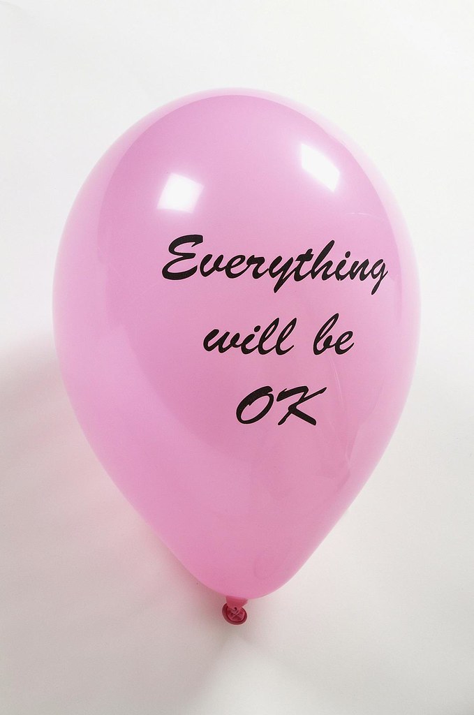
i liked that you chose this photo, so i just tried to add a uncomplicated font. i made it italic cause the shiny blanket was floating.


i like this one the best.
but lets wait to we have the cover

søndag 29. juni 2008

i like this top one a lot!! i think we should use it.
it will be easier for me to print also than the bottom one.

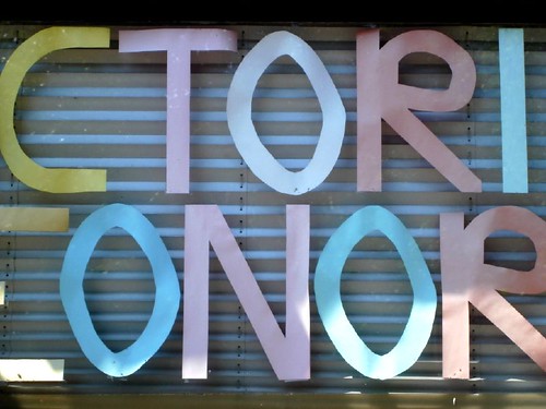
the larger areas of color will be better to print plus i really dig those colors, especially the bright green and the yellow color!

i'm working on a few simple covers that ill post soon too.

collage


maybe?

torsdag 26. juni 2008


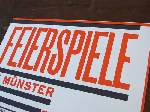
i set some type real quick for fun, i just found some more wooden type too, so maybe i'll play around some more with wood type. i agree that the typeface for the cover should be rather simple and classic to balance the collage.

i really like the blanket photo one you did... i'll keep working on different versions. :)

typography i like


i was thinking something classical would fit well with the collage. but maybe something other fit? i don´t know, lets just try different things. and i got to make the collage aswell! why am i only using times? u tell me

onsdag 25. juni 2008

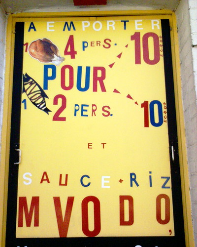
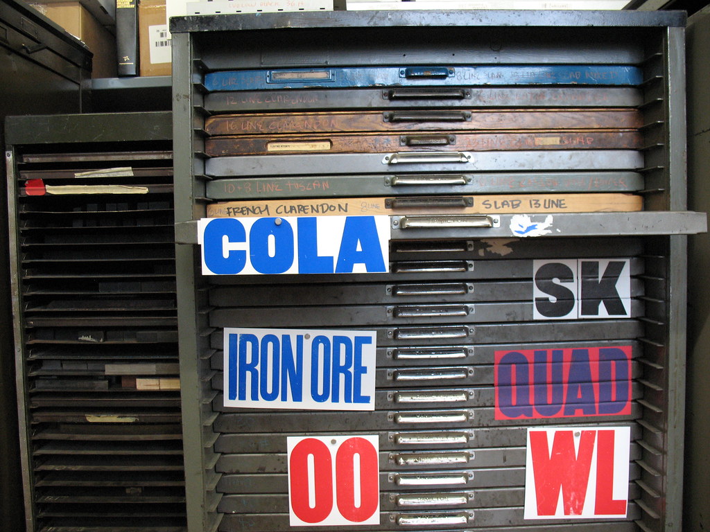
coverzzz need good typo---graphy


any images of type/font suggestions?

another cover sketch


Heres another cover sketch... I need to do something more with the type I have / am using. Customize some system fonts. At the moment I have a very bland group of standard type faces, any ideas for type??

søndag 22. juni 2008

a quik sketch for a cover


a quick first idea :) i took this picture and it came out like this...the type is conservative but i thought balanced the image.

what do you think?

i'm working on some more ... sounds good about the collage!!


p.s. -- we haven't settled on a title, right?
lets talk about that too. i'm open to lots of ideas for it. i just used u tell me here :)
hei nick,
this look great! i´ll start on a collage, with some bright colors, but not to bright. Maybe we should have a photographs with some nice typo on the cover of the book? think it will look nice to the collage.

i´ll post some collages real soon!

lørdag 21. juni 2008

two print versions


I printed both of the prints...they're the size of the book 7 x 10 inches, printed on a very heavy smooth uncoated paper. This photo isnt so good, but they both came out really nicely! If you think either should be bigger, I can re-print them. I'm working on a prototype package to show you.

p.s. this image is reversed for some reason...the prints are both the other way around in real life.

fredag 20. juni 2008

printed package to hold the book + prints


so i was thinking about printing a multi-colored heavy paper pouch/sleeve to hold the book and prints. i thought if you made a paper collage similar to the one above, i could print those colored shapes, then cut out, fold and glue it to make a package...sorry the image above isnt very clear.

ill post a more colorful and clearer version later tonight or tomorrow. let me know what you think, i think it could be a rad way of holding all the objects :)

søndag 8. juni 2008

onsdag 4. juni 2008

i think they should be smaller too.
we could make a pack with the book and the poster in it,
that could be a bigger, so the posters fit.
but then they can´t be 2 big,
soooooo.......
u tell me!

and maybe a print with 2 of your photographs?

tirsdag 3. juni 2008

i agree :)

the totem should be smaller i feel but the other may need to be folded, which i have mixed feelings about...

any ideas about how to incorporate them into the book?

i think we should begin to arrange the book into a final layout, i'd like to print it soon.

:)

mandag 2. juni 2008

maybe one or both posters should come with the book?
yeeezzzzz

søndag 1. juni 2008

???

maybe? in combination with something else?